Making Temporary Work Durable
Filippo Spagnoli
How Total Design managed to present an uncertain world as a stable one
How can instability be made to look reliable?
In the Netherlands of the 1960s and 1970s, graphic design emerged as a central tool in shaping institutional presence. As companies expanded across multiple contexts and media environments, corporate identity was no longer limited to logos or printed materials: it became a structured system capable of organizing how institutions could be perceived reliable over time.
In the same period, temporary work, by contrast, remained deeply unstable. It existed through fragments: short-term contracts, shifting roles, uncertain continuity. As staffing agencies expanded across Europe, this instability was understood as structural, influencing public perception: temporary labor was seen as unreliable, positioned at the margins of stable occupation.
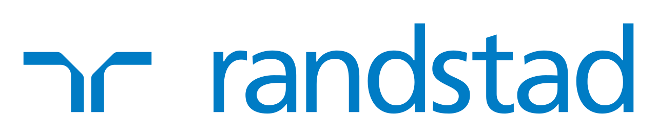
And yet, Randstad, founded in 1960 and rapidly growing into one of Europe’s largest recruitment services, managed to present itself as something remarkably different: reliable, efficient, and modern. This was not achieved through communication alone. Working with Total Design, the Dutch modernist studio led by figures such as Wim Crouwel and Ben Bos, Randstad developed a corporate identity system that did more than organize communication: it structured how the company could be perceived. Rather than relying on the repetition of fixed forms, the identity established the conditions under which variation remained controlled, recognizable, and coherent: across documents, advertisements, and everyday materials. What emerges from this case is not only a well-designed identity, but a broader insight: when work itself is uncertain, design can serve as a means for structuring how it is perceived as a source of stability.
When Stability is on Leave
In the decades following the Second World War, graphic design in the Netherlands developed in close relation to the expansion of mass communication. As organizations grew and operated across multiple contexts, the need for visual coherence became increasingly central: design was no longer limited to individual artefacts, but began to take the form of structured systems capable of organizing communication over time.
Within this broader shift, the development of a corporate identity emerged as a strategic tool. It allowed companies to appear consistent, legible, and reliable, even as their operations became more complex (Huygen 2017, 94). For Randstad, this need was particularly acute. The company operated in a sector marked by structural instability and social distrust (Oonincx 2022). Since temporary employment remained associated with insecurity and lack of continuity, establishing trust was not simply a matter of actual efficiency, but of perception.
For this reason, creating a corporate identity became a vehicle, for making a unstable business appear structured, consistent, and trustworthy—day after day, across every touchpoint.
Office Rules
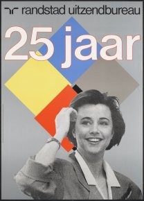
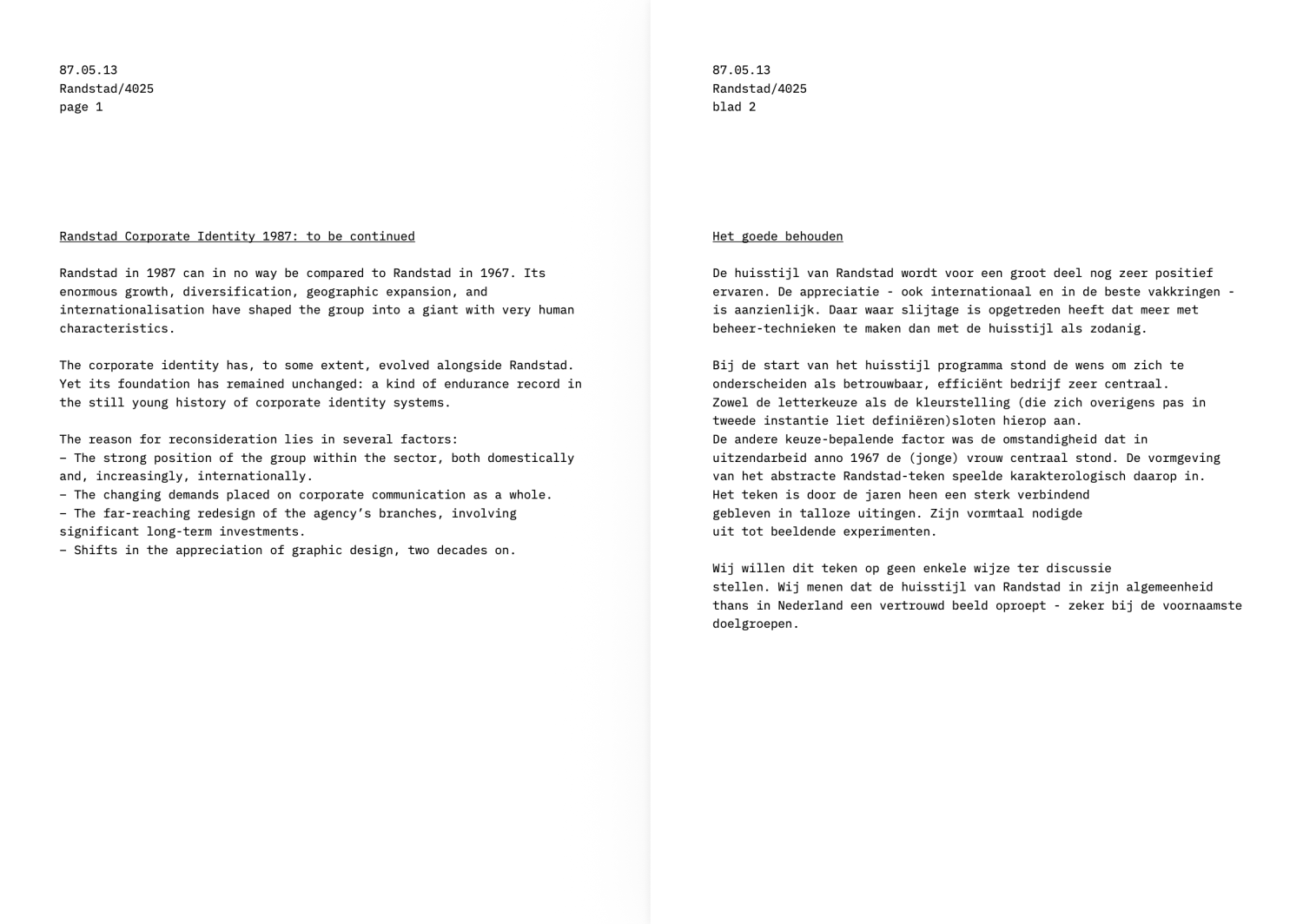
Originally designed in the late 1960s, the Randstad identity was updated in 1987 as the company expanded internationally. This transition becomes visible in the corporate identity manual preserved in the Total Design archive at the Amsterdam City Archives. Concise and visually restrained, the booklet reads less as a design presentation and more as a set of instructions: indeed, what it defines is not a visual style, but a framework.
At its core is a clear position. Rather than developing a new identity, Total Design was asked to update and preserve an existing one. The manual states that “the basis has remained unchanged,” while identifying a set of elements that certainly should not be altered: the logo is described as balanced and durable; blue is reaffirmed as the defining color of the company. These elements act as fixed points within the system.
At the same time, it allows for change. The typographical shift is justified in terms of clarity and tone, yet presented as part of a continuous identity, while new colors are introduced around the dominant blue. These adjustments extend the system without betraying its true visual essence.
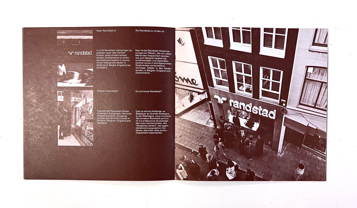
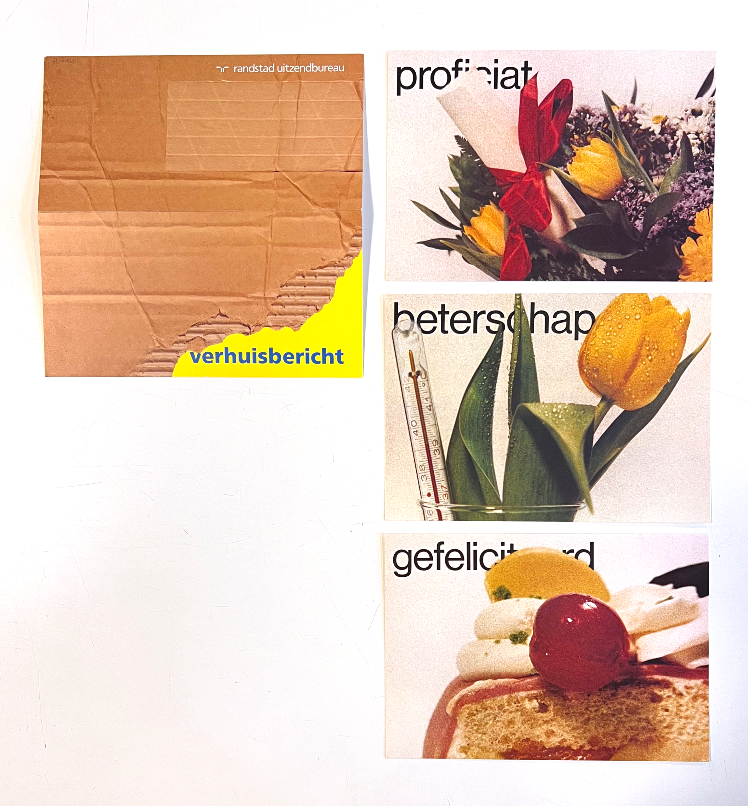
The archival material displays how this logic operates in practice. Technical documents such as letterheads, forms, and internal materials follow strict rules. Layouts are consistent, hierarchies are stable, and color is used in controlled ways—these are the places where the system is most rigid. In contrast, posters, brochures, and campaign materials display a wider range of variation and creativity: color becomes more expressive, compositions shift, and images play a larger role, yet the underlying structure remains recognizable. The same elements keep organizing the material, even when the composition changes.
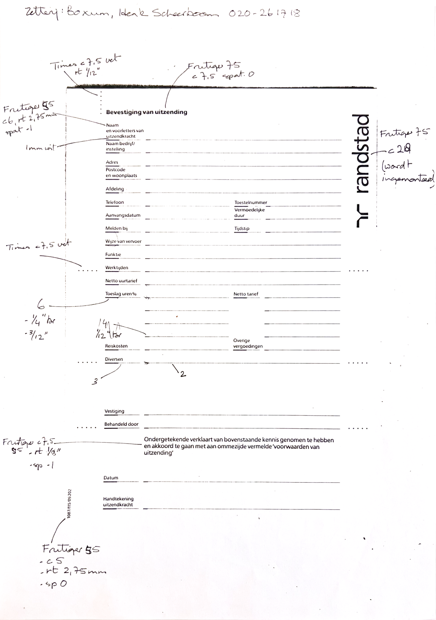
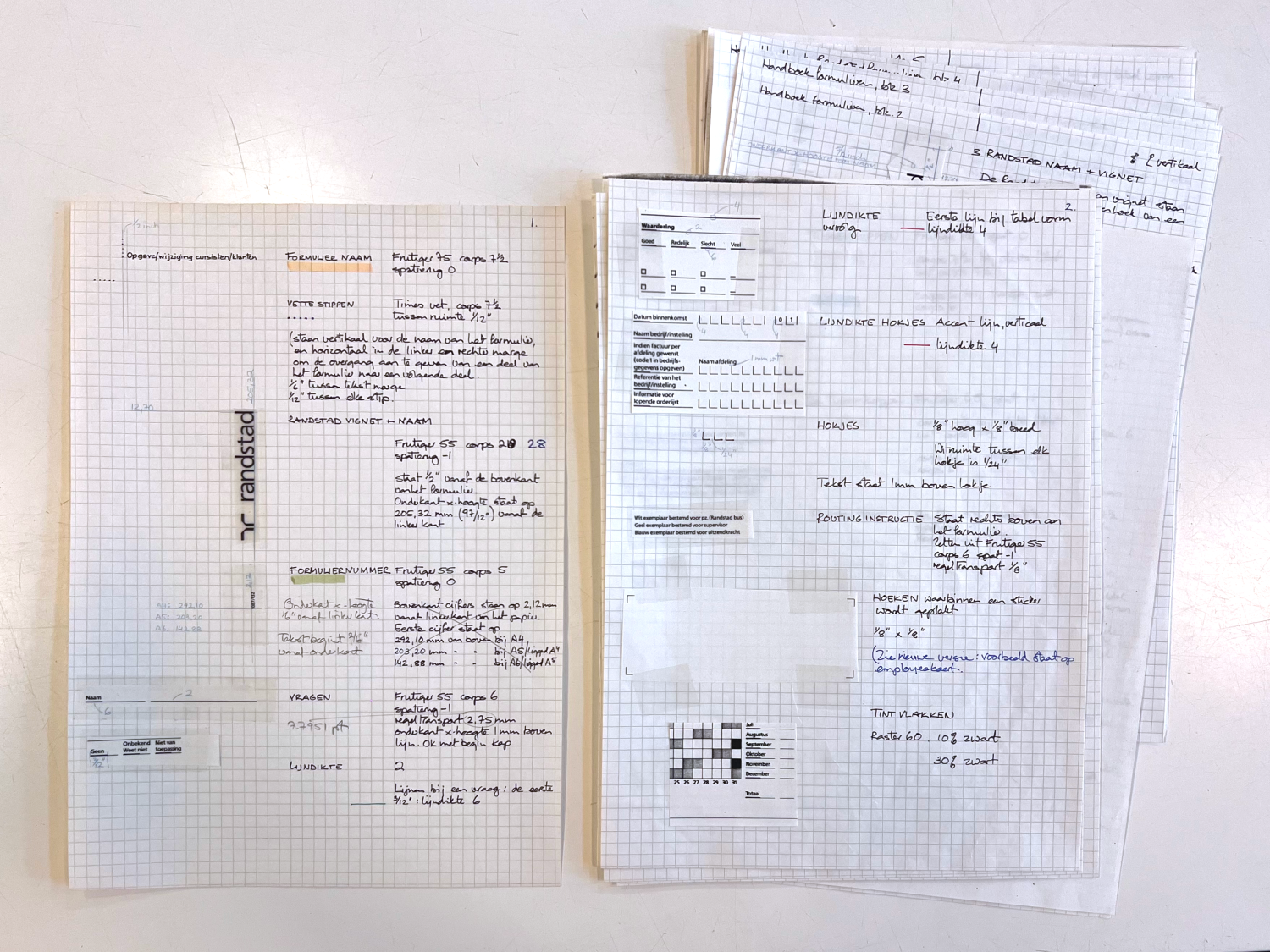
What strikes the most while scrolling through the archival materials, however, is not the visual system. Among the printed outputs and finished applications, sheets filled with manual drafts can be found: elements cut out, repositioned, annotated, carefully tested on squared paper. Far from being polished artefacts, these are working surfaces that bring back insights on how the studio approached the creation of a huisstijl— the Dutch word for corporate identity.
Staffing the Right Crew
Like a well-functioning team, the graphic system was composed by selecting the right elements: every one capable of its role, but also creating a perfectly oiled mechanism when interacting with the others.
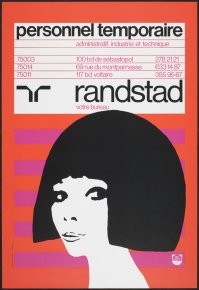
Enduring logos are immune to trends. And the Randstad logo, designed by Ben Bos, has ruled over the temp-work industry for decades. Abstract and symmetrical, with its two mirrored “R” forms, it avoids direct representation while establishing a clear sense of balance. This duplication, though, can be read as more than just a visually pleasing symbol. In fact, it represents a sort of twofold bridge, connecting employers and employees. At the same time, the negative space between the two forms creates a subtle funnel-like shape, almost a filter, visually suggesting a process of sorting and directing flows with precision.
However, it’s not only a shape that makes a logo unique. Blue becomes the defining tone of the identity, rooted in standard printing colors such as Process Blue and Reflex Blue. Over time, this is refined into a more controlled specification centered on PMS 285. The choice is pragmatic and straightforward, providing the system with a stable chromatic base.
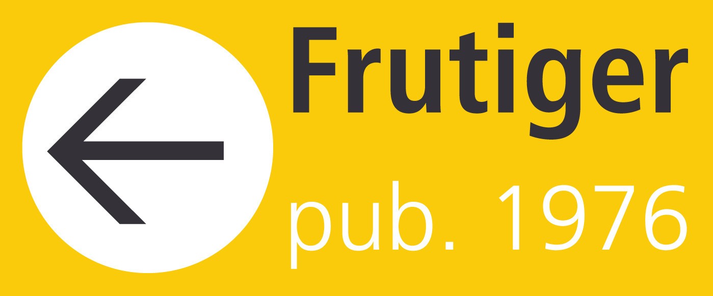
Typography, nonetheless, marks the point where adjustment becomes visible. In the 1960s, Helvetica embodied the modernist belief that clarity and neutrality could themselves communicate efficiency and rationality. By the 1980s, this rigidity had begun to soften. Helvetica is replaced by Frutiger, less tied to the visual language of the 1960s and more unique, legible and spatially oriented (unsurprisingly, given its origins in signage design). The introduction of the serif Plantin responds to longer texts, as readability becomes central and the typographic palette is expanded.
Taken together, this carefully assembled set of elements marks the shift towards a cohesive yet flexible visual system, that is built to endure.
Values at Work: A Semiotic Reading
Before concluding, it is worth looking at the Randstad identity from a different perspective. Rather than just communicating stability, it actively produces it at the level of perception. And, if the designer can be understood as a “sign engineer” (Raff 2019), this is where a semiotic perspective becomes useful.
Semiotics examines how meaning is produced through signs, revealing how visual elements are arranged and interpreted within specific contexts. While the language of branding only became dominant in the 1980s, projects such as Randstad already anticipated many of its core mechanisms. In this case, every element contributes to a complex identity system: from the graphic composition of ads to their tone of voice—even the design of physical branches. And through precise orchestration, such system is able to convey particular values: in the case of Randstad, reliability, efficiency, and modernity. These are the principles that drove the company since its foundation, and that Total Design reaffirmed, both implicitly and explicitly, through the 1987 update (Marrone 2007).
Adopting this perspective allows us to move beyond a superficial reading of design. Instead of focusing only on its most visible elements, it directs attention to the broader system through which meaning is structured. In doing so, it also suggests a more complex role of the designer, one that operates not only on form, but on the organization of perception itself.
Making temporary work look durable was no easy task. But Randstad, by embracing this system, was able to reshape its public perception. And both companies and workers, over time, turned to the agency that appeared most efficient, reliable and modern—recognizing it in the same twofold “R” that still dominates the market.
_______
This shortened article is part of a series of student papers written for the course "Graphic Design as a Mediator in Public Space," taught by Richard Niessen and Kylièn Bergh, fellows of the Wim Crouwel Institute.
Sources
Amsterdam City Archives. Randstad Corporate Identity Manual (1987).
Huygen, Frederike, and Lex Reitsma. Modernism: In Print. Dutch Graphic Design 1917–2017. Eindhoven: Lecturis, 2017.
Marrone, Gianfranco. Il Discorso di Marca. Modelli Semiotici per il Branding. Rome-Bari: Laterza, 2007.
Oonincx, Martin. Regulating Temporary Agency Work: A Balancing Act. Tilburg University, 2022.
Raff, Jan-Henning. “Theories to Understand Graphic Design in Use: The Example of Posters.” In The Graphic Design Reader, edited by Leslie Atzmon and Teal Triggs, 449–456. New York: Bloomsbury, 2019.